
Project Overview
Our UNC UX/UI design class had the opportunity to partner with Jury-X, a Chapel Hill-based litigation consulting firm that helps attorneys use research and strategy to select fair and favorable juries. Our challenge was to design a streamlined dashboard for their attorney partners. This design needed to bring together jury data, research findings, and strike strategy into a tool that was intuitive, flexible, and courtroom-ready.
Jury-X says, Knowing your jury makes all the difference in a trial. I believe the same logic applies to design: knowing your user makes all the difference in your product. From the start, my goal was to truly understand the needs of our future users. Through interviews, testing, and iteration, I created a dashboard that reduces cognitive load and helps attorneys make confident, real-time decisions when it matters most.
Audience Analysis
As a class, we began our design process by researching U.S. lawyers to better understand our users. I was especially interested in exploring how these insights could inform design decisions down the line, particularly in creating tools that feel intuitive, relevant, and responsive to attorney needs. Below is a brief table summarizing some of the key demographic and behavioral research we compiled.

- Key Takeaways for Design
- Lawyers are older (median age: 46)
- Design with clarity and ease-of-use in mind—simple, intuitive interfaces work best.
- Attorneys use iPhones (80%)
- Ensure mobile optimization, especially for iOS users working on the go.
- Demand varies by region
- Allow for personalization by region.
- Lawyers are older (median age: 46)
- Sources
- U.S. Census Bureau. (n.d.). National Population Totals and Components of Change: 2020–2029. Retrieved from https://www.census.gov/data/tables/time-series/demo/popest/2020s-national-detail.html
- National Center for Education Statistics. (2022). Educational attainment of young adults. Retrieved from https://nces.ed.gov/programs/coe/indicator/caa
- American Bar Association. (2024). Profile of the legal profession: Demographics. Retrieved from https://www.americanbar.org/news/profile-legal-profession/demographics/
- Hudson, J. (2021, November). ABA Tech Survey 2021: iPhone usage among lawyers. iPhone J.D. Retrieved from https://www.iphonejd.com/iphone_jd/2021/11/aba-techsurvey-2021.html
Persona Work
Thanks to Jury-X, I had the unique opportunity to interview one of their clients and a few employees. In class, we compared our interviews and personal notes. These conversations helped us identify key patterns and user needs in the jury selection process. As a group, we then created a list of potential personas and began to target a user identity.

- Persona Examples
- Turbo Tom – A post-grad tech whiz who works at the speed of thought. Known for his lightning-fast coding, automation mastery, and near-instant problem-solving, Tom optimizes everything—including his own efficiency. With an equal background in Law and Computer Science, his hobbies and admiration for the tech world directly affects the approach he takes to his profession. His personality is sometimes sacrificed for his work ethic, his quietness or shyness is no sign of weakness, more so a sign of his unbreakable focus to complete his task at stake. If there’s a faster way to do something, he’s already built the shortcut. Whether he is in or out of the courtroom, his priority is always to operate as fast as possible, while equally balancing his quality of work and
efficiency. - Elena Richhart– Seasoned attorney that knows the tricks of the trade. She works as a team with fellow attorneys from her practice. She uses traditional methods that she learned from her mentors. Creating a chart with pens, highlighters, and paper she color codes jury members based on their responses to questioning. She has to double time taking notes for her partner while he questions. This level of multitasking requires her to act with agility and speed. Because she has been doing this for awhile she has difficulty seeing how she can integrate tech into the work. Will it have the flexibility she needs? How could it translate her coding methods to
digital interactions? While Elena relies on critical thinking and factual research she also is a firm believer in gut instincts. Elena cares about her clients. She is committed to giving them the best chance at winning, part of that stems from her making sure that the Jury will view them fairly. - Honest Hugh – A younger attorney dedicated to maximizing efficiency while ensuring the elimination of bias to uncover the truth. He believes thorough, long jury selections are crucial in jurors’ backgrounds and biases. Although he thinks finding information is important, it always comes down to a gut feeling for him. His commitment to honesty drives him to keep pushing for the truth, often leading to slower, more careful processes. This approach sometimes results in indecisiveness, especially when trying to “save a person” or
uncover nuanced truths. - Old School Olaf – A seasoned attorney close to retirement, Old School Olaf is old-school and likes to stick to pen and paper in the courtroom. He is very well-versed in the law, acting as a strong advocate for eliminating bias and uncovering the truth. To Old School Olaf, the process is nothing new and he is used to taking his time with jury selection. He tries his best to keep up with the times but tends to fall behind with technology, and still prefers to do things the old-school way. He is stressed and feels the need to retire soon because he can’t keep
up with the changing times.
- Turbo Tom – A post-grad tech whiz who works at the speed of thought. Known for his lightning-fast coding, automation mastery, and near-instant problem-solving, Tom optimizes everything—including his own efficiency. With an equal background in Law and Computer Science, his hobbies and admiration for the tech world directly affects the approach he takes to his profession. His personality is sometimes sacrificed for his work ethic, his quietness or shyness is no sign of weakness, more so a sign of his unbreakable focus to complete his task at stake. If there’s a faster way to do something, he’s already built the shortcut. Whether he is in or out of the courtroom, his priority is always to operate as fast as possible, while equally balancing his quality of work and
- I chose to build out one of the personas, Elena Richhart, using empathy mapping and scenario work.
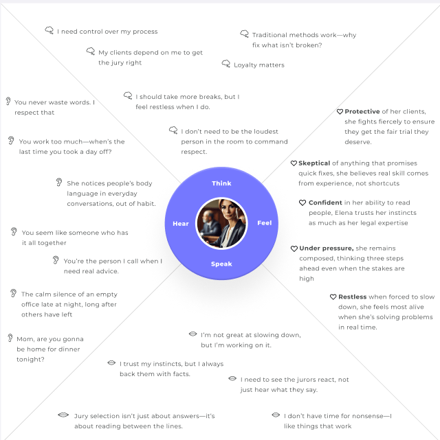

Creating detailed personas helped me see just how diverse attorney needs can be during the voir dire process. Through characters like Elena Richhart, I realized that a successful design needed to balance tech-forward functionality with traditional workflows. Attorneys needed a dashboard that emphasized trust and speed and reduced cognitive load during high-pressure jury selection. Ultimately, the personas grounded my design choices in real human behaviors.
Brainstorming Dashboard Development
Next, I began identifying key assets and mapping out the user journey using techniques like card sorting, user flows, and logic diagramming. These methods helped me clarify the structure, prioritize features, and ensure that the dashboard aligned with users’ mental models and workflows.


Using the input that I received from card sorting, I decided to nest assets within other assets. For example, I realized that features like strikethrough and highlight would make the most sense when nested in the juror cards.
User Flow 1
- This user flow goes through the process of setting up the Juror cards configuration. One note that Jury X made was that it was important that users could change the layout of the juror cards based on the layout of the courtroom. I thought this would be a beneficial flow to highlight.

User Flow 2
- This second flow goes through the process of adding various notes to a juror card. It splits into three possible user flow branches. One for striking out a juror. One for connecting a courtroom transcript to a juror card and one for using the highlighter tool to color code a juror card.

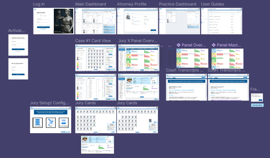
Prototyping : Building the Dashboard
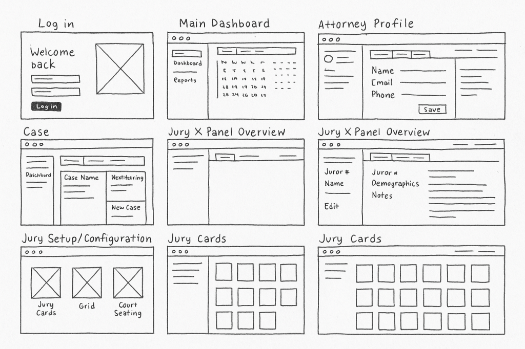
Once I had a better understanding of a user’s journey I was able to start building the prototype. I began the prototyping process with hand-drawn sketches to quickly ideate and visualize layout options.

I then digitized these sketches to organize and refine the structure before translating them into wireframes. This helped me define user flow and functionality more clearly


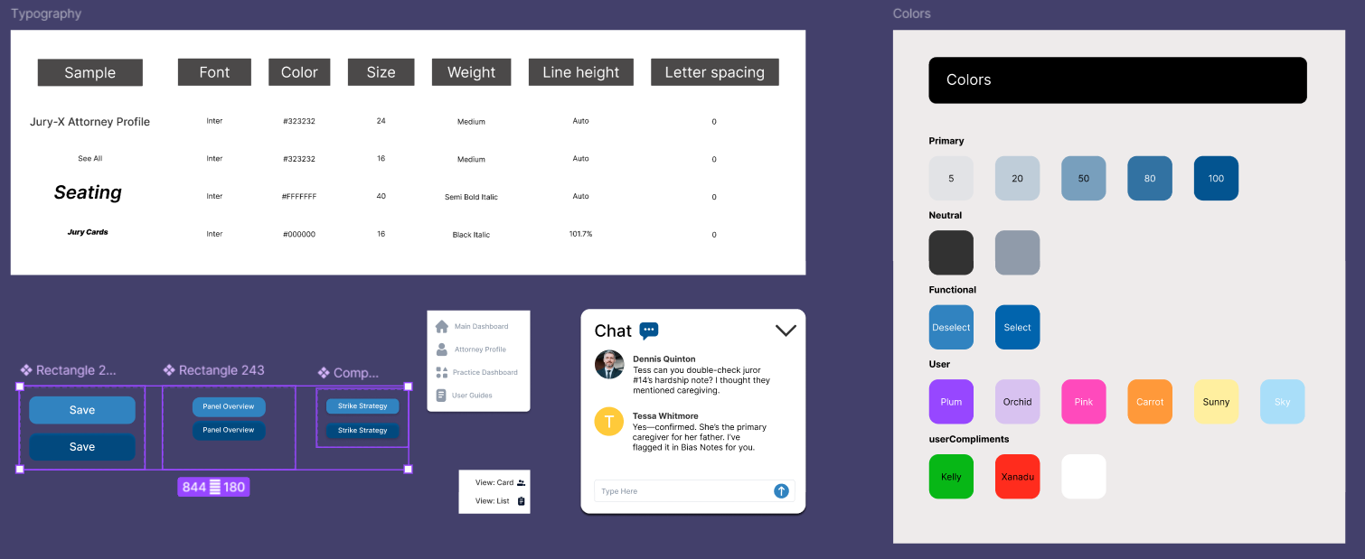
From there, it was time to create a UI Kit to establish a cohesive visual language. I developed a consistent set of components, including typography, color palettes, buttons, and icons, to guide the design system and ensure visual alignment across the interface.
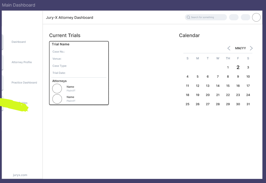
With the UI Kit in place, I moved on to building a functional prototype. Using the components and design system I had established, I created an interactive mid-fidelity prototype that allowed for user testing and feedback. This step was essential in validating the layout, navigation flow, and overall user experience.
Key steps in this phase included:
- Preparing the prototype for usability testing and stakeholder review
- Translating UI components into clickable interactions using Figma
- Designing intuitive navigation between screens
- Ensuring consistency across layout, spacing, and user actions
Click below to explore the initial prototype.
Test : Iteration Based on Feedback
To evaluate the usability of the mid-fidelity prototype, I conducted user testing through UserTesting.com, where three participants completed task-based sessions. The goal was to understand how easily users could navigate the interface, complete essential tasks, and offer actionable feedback.

- Participants:
- 3 remote users recruited via UserTesting.com
- Tasks Included:
- Logging into the dashboard
- Exploring main features and layout
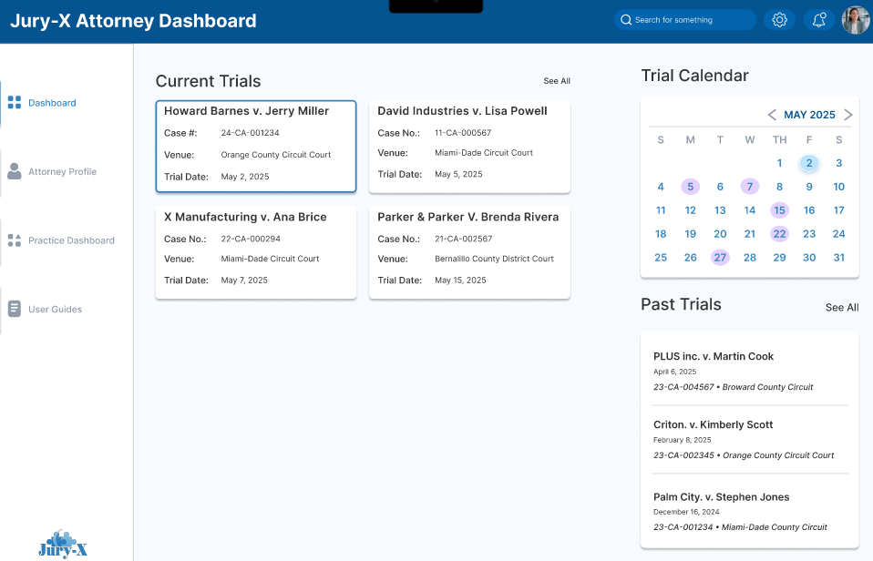
- Opening a specific case (e.g., Howard Barnes v. Jerry Miller)
- Switching the jury view to “list view”
- Navigating to Strike Strategy and removing Juror #10
- Key Findings:
- What Worked Well:
- Users described the layout as “logical” and “clean”
- Clear hierarchy helped users stay oriented
- Strike feature was described as “easy to use”
- What Needed Improvement:
- Some confusion around where to change view layouts
- Users wanted clearer icon labels or hover states
- One tester suggested a clearer onboarding or tour for new users
- What Worked Well:
Final Prototype
For my final prototype, I focused on making the interface more intuitive and efficient based on the feedback I received. I simplified the components to keep things clean and easy to follow, added color coding to help users quickly scan and analyze information, and introduced clear symbols to make key actions more obvious. I also reduced the number of clicks needed to complete tasks, so the whole experience feels smoother and more user-friendly. I realized this was essential, especially in a fast-paced environment like a courtroom.


Explore the final Prototype!
