From insight to impact—designing for real-world maternity care gaps.
Challenge
Over 2.2 million people of childbearing age in the U.S. live in maternity care deserts; areas with limited access to OB-GYNs, birthing hospitals, and trusted healthcare resources. First-time parents in these regions often face isolation and uncertainty during pregnancy.
Our Solution
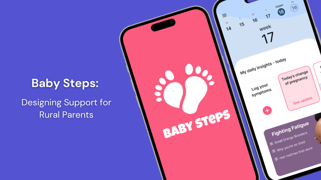
Baby Steps is a mobile app designed to support expecting and new parents, particularly those in rural areas, by delivering personalized, trustworthy, and accessible pregnancy support.


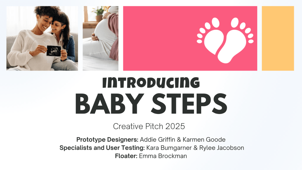
Project Overview
Over 14 weeks, our team set out to design something deeply personal and purposeful, a maternal health app for parents who often feel overlooked. This challenge wasn’t just theoretical for us; each of us had a personal connection to someone who had experienced the isolation, anxiety, or lack of support that comes from living in a maternity care desert. That made this work feel especially urgent and meaningful.
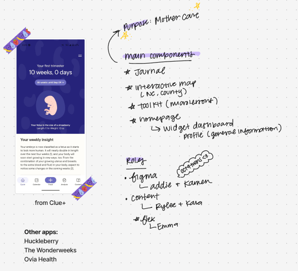
I led UX research, co-created instructional content, and designed our final pitch deck. Alongside Addie Griffin, Karmen Goode, Emma Brockman, and Kara Bumgarner, we built Baby Steps using Figma, Adobe Creative Suite, Google Forms, and Canva.
Together, we transformed research, interviews, and design sprints into a product that feels calm, supportive, and easy to navigate—just like we hoped it would for parents like Jane.
Design Process
We grounded our work in the design thinking process:
Empathize
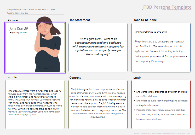
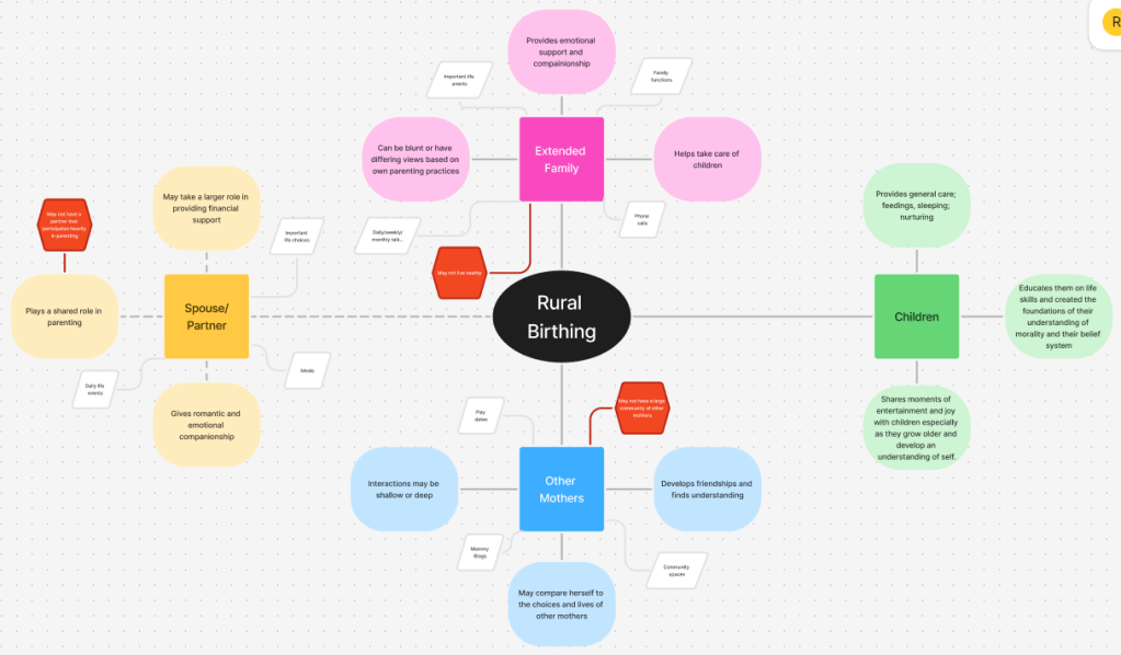
We began by exploring stories, research, and personal interviews with parents living far from healthcare access. We listened for moments of fear, overwhelm, and uncertainty, especially among first-time parents. A major theme emerged: people weren’t just lacking services—they were lacking trusted, ongoing support.
Define
We translated those stories into a set of core user needs:
- Accessible, trustworthy information
- Emotional and mental health check-ins
- Localized resources and care connections
- A sense of calm, clarity, and continuity
From these, we defined our design challenge:
How might we create a digital support system for parents navigating pregnancy without reliable local care?

Ideate
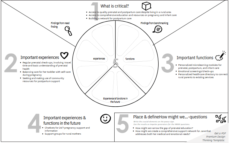
Our team brainstormed and sketched potential solutions. We landed on three key features that could evolve with the user’s journey:
Key Features
We wanted to integrate three specific features:
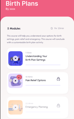
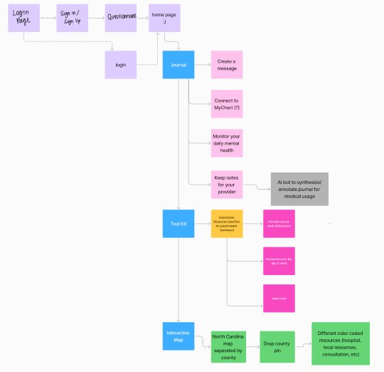
- Personalized Educational Resources tailored to the user’s pregnancy stage
- Mood Journal for tracking emotional and physical well-being
- Interactive Resource Map connecting users to local providers, support groups, and services
User Journey Highlight
As users explore the app, they shape a personalized experience that evolves with their needs.
From the moment they land on their custom dashboard, they can access tools, tips, and timely information. Baby Steps grows with them through pregnancy and into postpartum, offering continuous support with updated content and new features along the way.
I worked closely on the education strategy, applying my instructional design background to ensure the content was inclusive, digestible, and stage-appropriate.
Prototype
Using Figma, Adobe Creative Suite and Canva, we built a high-fidelity prototype that blended clear structure with a warm, inviting visual design.
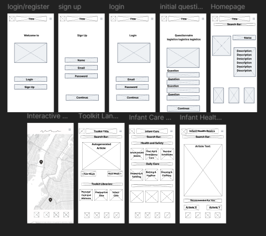

The interface included just-in-time resources, a soft onboarding experience, and personalized highlights for each user.
Test
We conducted qualitative testing with users aged 18 to 53, representing rural, suburban, and urban communities.
Each participant interacted with our high-fidelity Baby Steps prototype and completed key tasks like onboarding, journaling, and accessing educational content.
What we tested:
- Homepage and feature navigation
- Onboarding flow and clarity
- Educational content credibility and usefulness
- Journal and resource map functionality
- Overall design and visual appeal
What we learned:
- Users described the app as “clean,” “simple,” and “easy to use”
- All users successfully completed the core tasks
- Common issues included:
- Onboarding loops
- Inconsistent terminology (e.g., “Education” vs. “Articles”)
- A desire for more visuals and interactive content
Next steps based on feedback:
- Fix logic loops in onboarding
- Streamline page labels and navigation
- Add multimedia (videos, charts, images) to boost engagement and trust
- Revisit visual design to make the app more inviting
Final Prototype
Following our usability testing, we pitched our final prototype, created a Lean Business Model Canvas, and iterated on the design based on real user feedback. These final deliverables helped us clarify the app’s value, define potential revenue models, and strengthen both the visual and functional aspects of the product.
Explore our Final Pitch!
Reflection
This project extended beyond a typical class assignment. Our team brought personal insight and awareness of the real challenges people face when navigating pregnancy without consistent access to care. That perspective helped us stay focused on designing something practical, thoughtful, and user-centered. We’re proud of the work we produced and the way we combined research, collaboration, and empathy to inform our decisions.
Explore our Final Prototype!

